In 2008, I spent a lost weekend googling absurd combinations of words in an attempt to discover groupings that brought back zero search results. The main rules I followed were ‘No proper nouns,’ and ‘Each word in a combination must bring back at least one search result by itself.’ I did not group the words in quotation marks, which would have meant that I was only searching for their occurrence together as phrases. Instead, I was looking for words that had never coexisted together on the internet in any way.
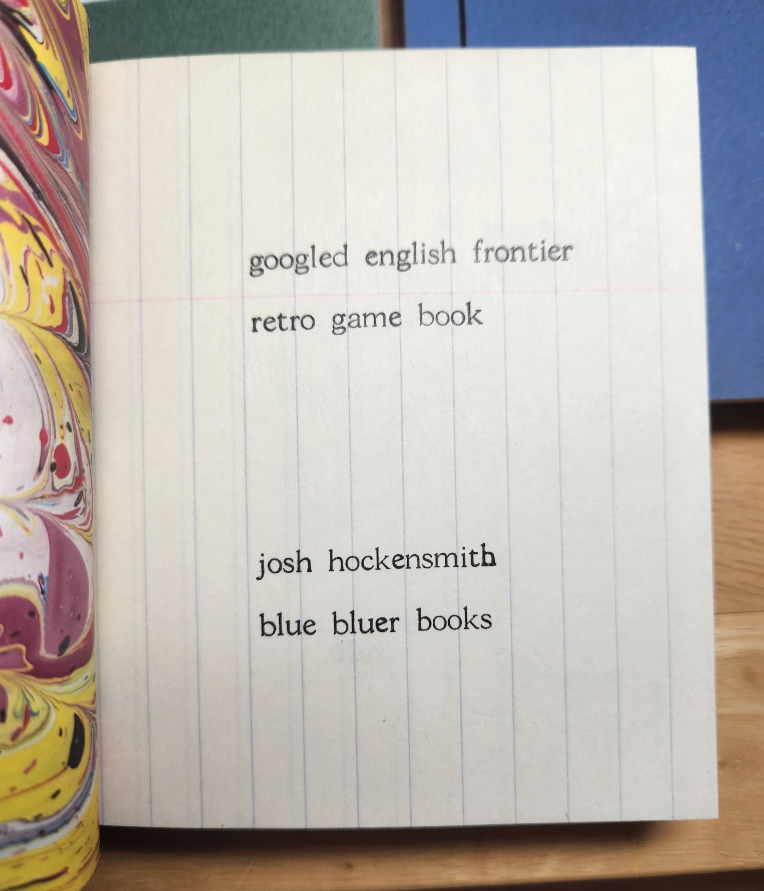
After much tweaking and fine-tuning, I finally compiled thirty 2- and 3-word groupings that could not be found anywhere in the linguistic cosmos of the internet. These became the basis for two artists’ books in what I called the Googled English Frontier Project.
Now that AI is in full swing, radically transforming our information universe, I decided to revisit the GEFP. At first I considered making a book with updated results. When I tested two of the original phrases using Google’s AI-assisted search, its response was something like “This is a nonsensical phrase, probably written as a joke.” Touché, bot.
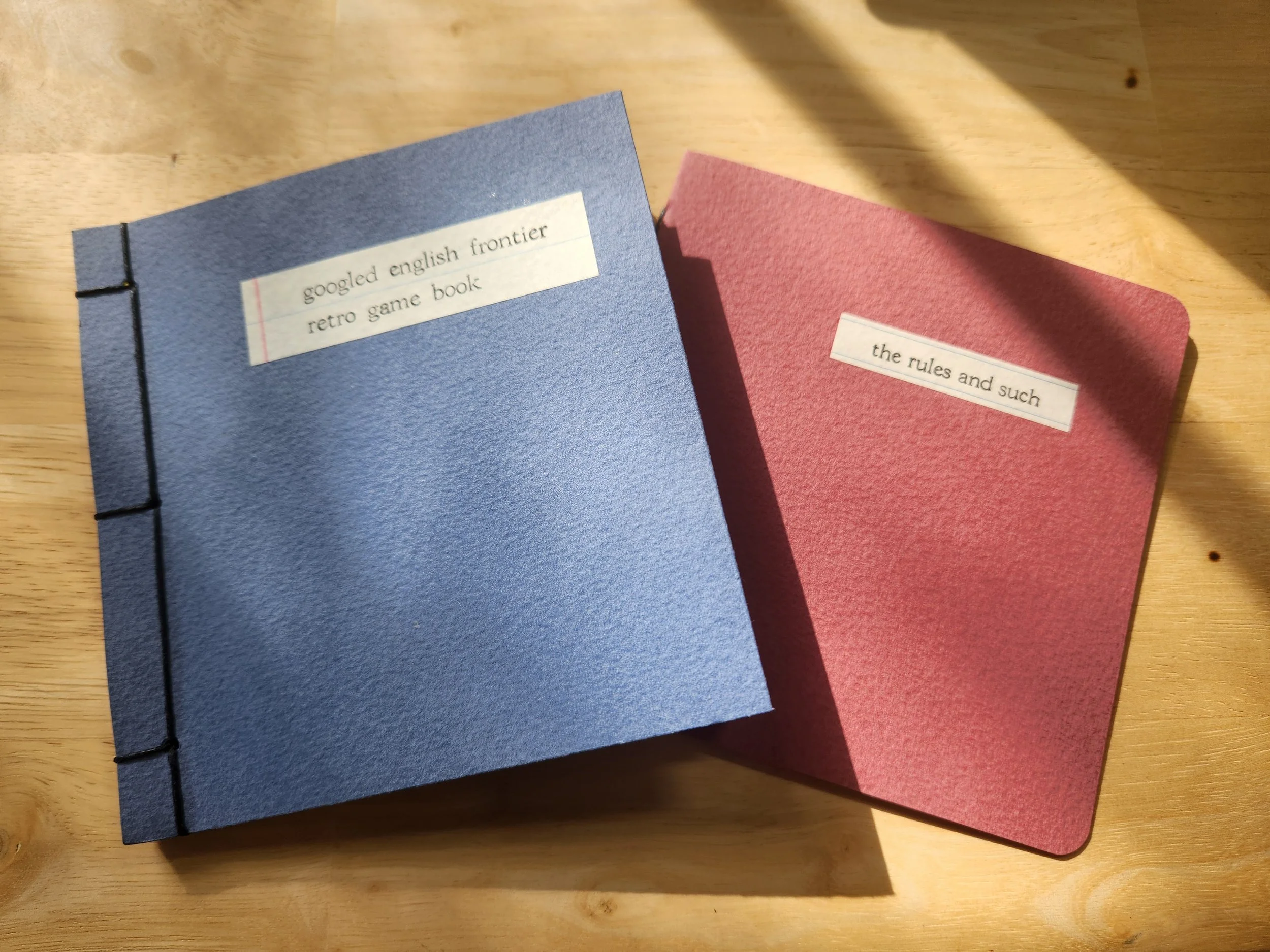
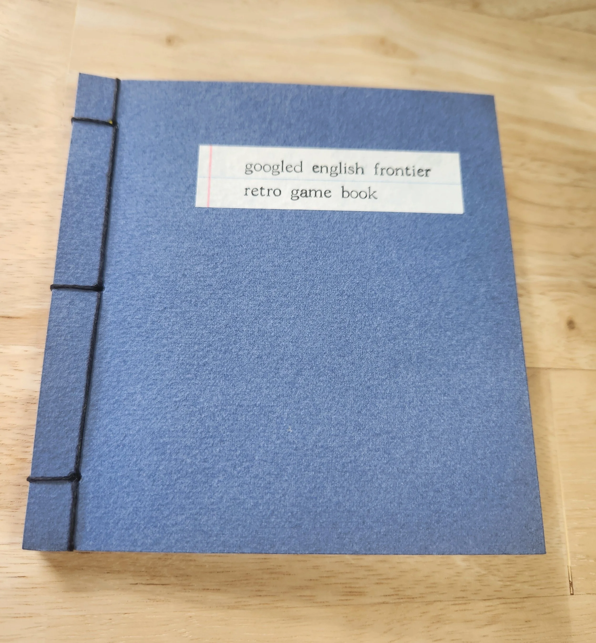
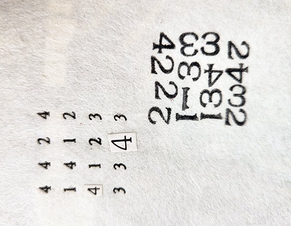
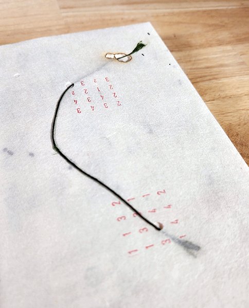
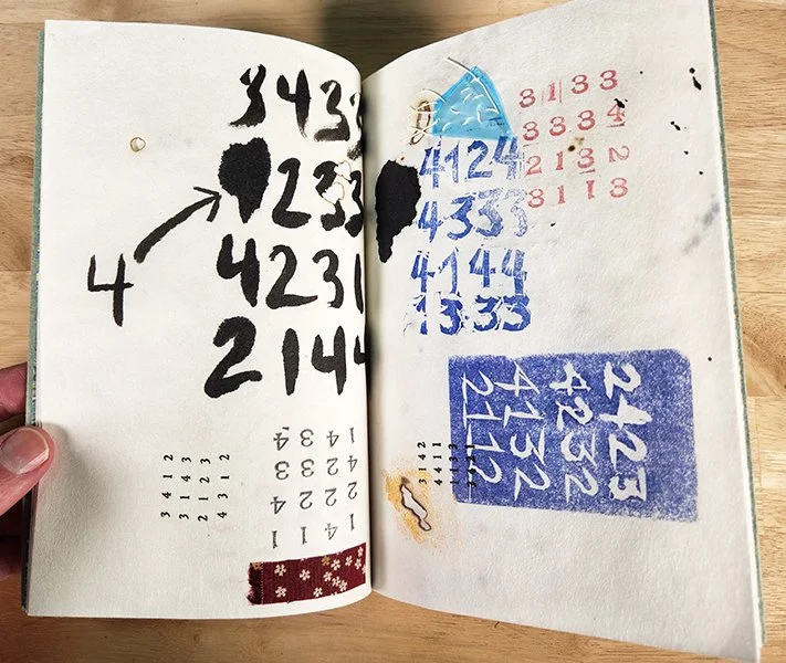
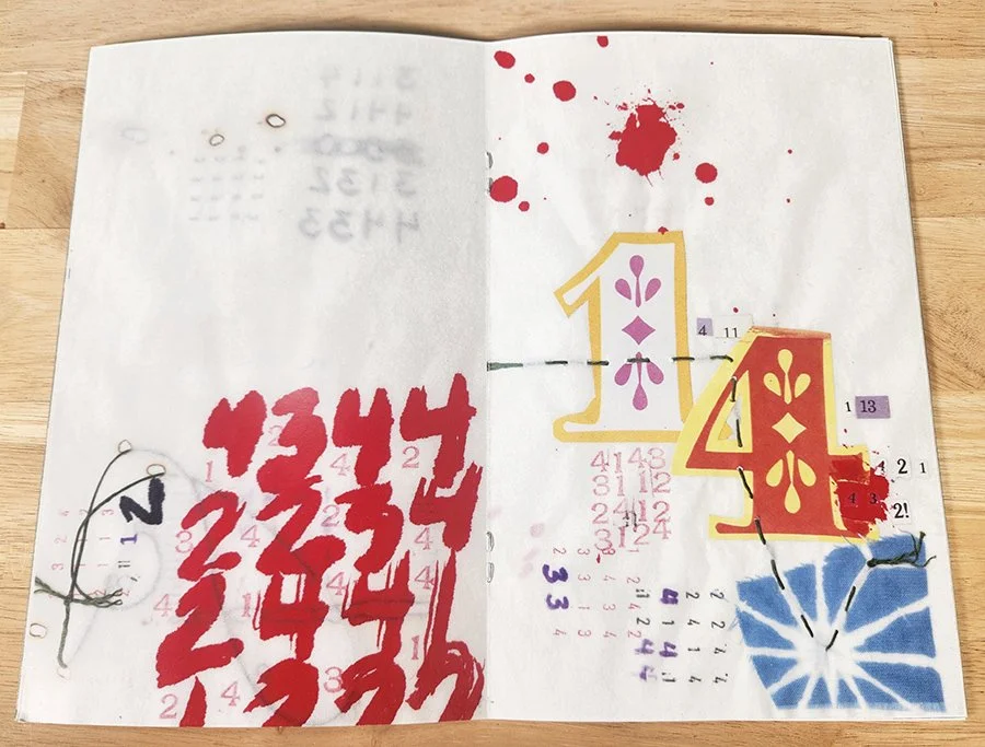
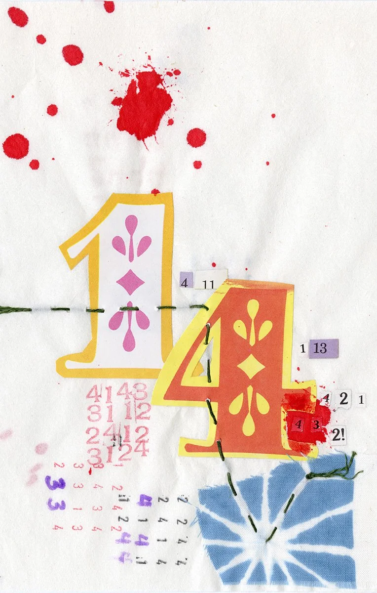
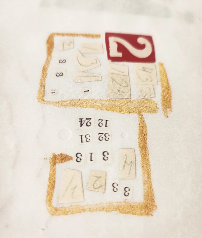
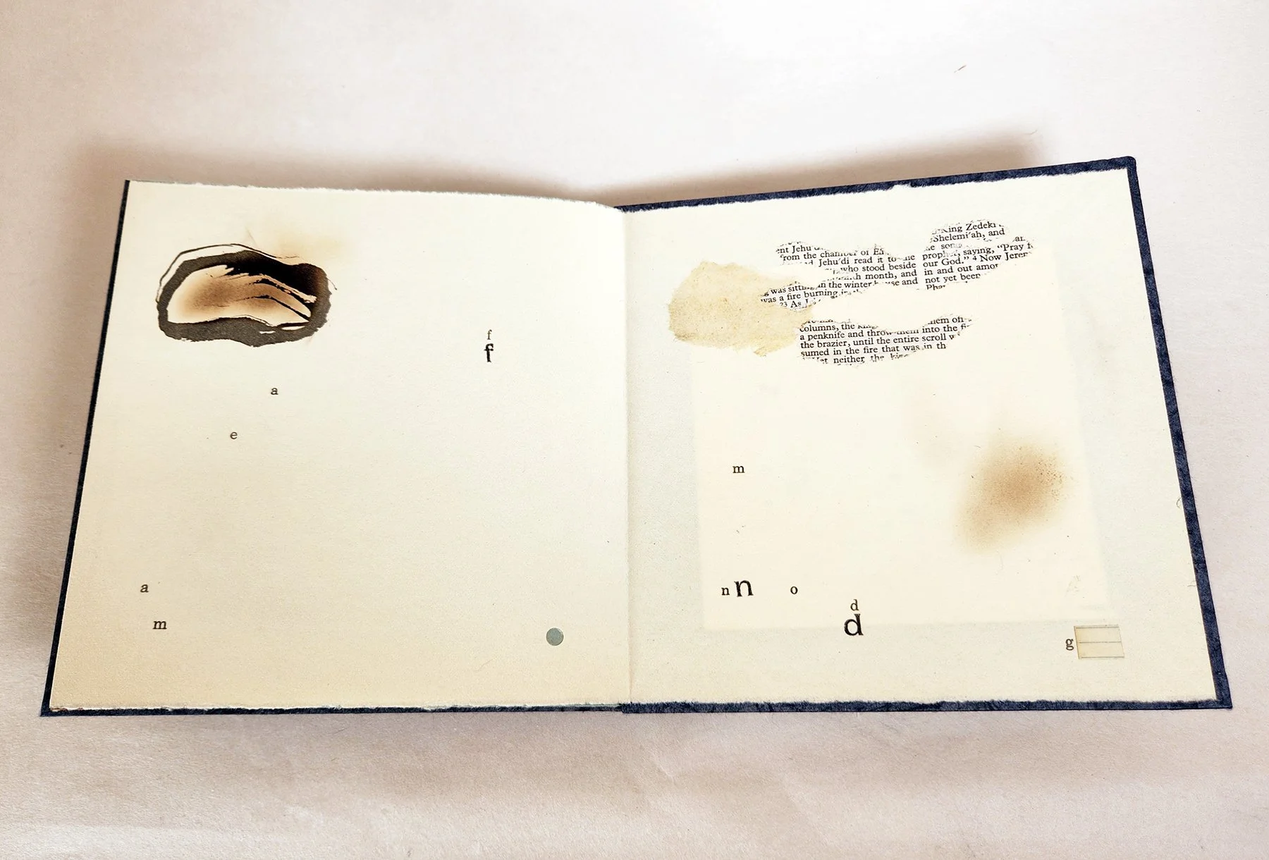
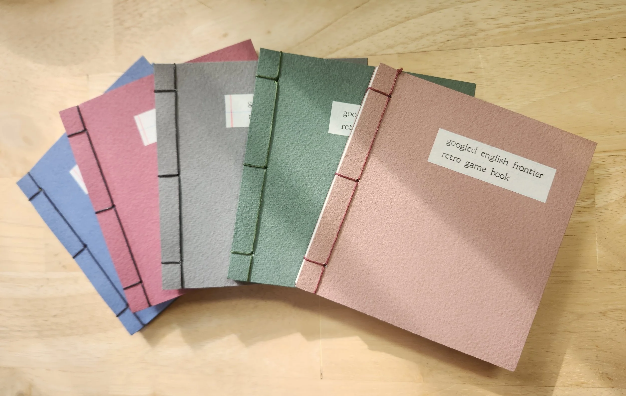
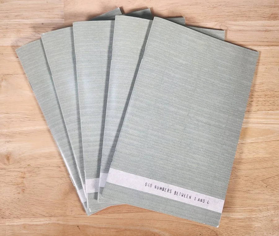
So instead of re-searching the phrases to work with new results, I decided to make a book that leans into how dated the original premise already feels, after such a short time. This new book features 15 of the project’s original phrases that had zero search results in 2008. It also includes 15 of my favorite phrases that did have search results at the time. A pamphlet accompanies each copy of the book, suggesting rules for how to play the book as a game, guessing which phrases had results or not, and if so, how many results each one had.
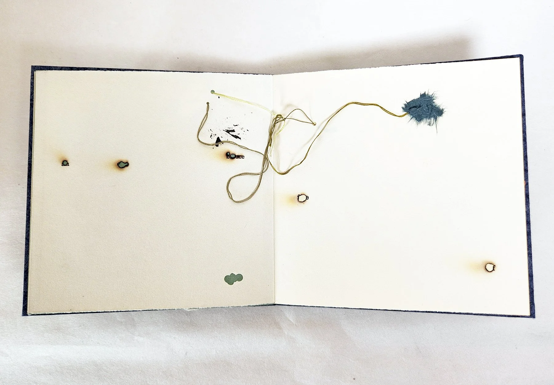
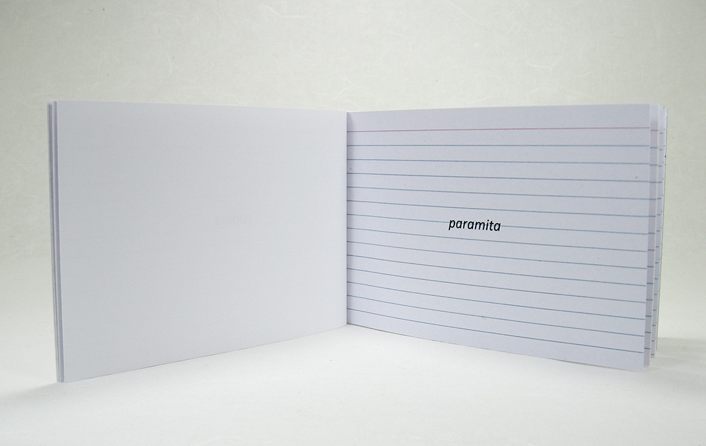
In keeping with the retro aspect of the project, I’ve hand-set the phrases in lead type and printed them using a 3”x 5” Kelsey Excelsior press named Matilda. I’ve produced two print runs to begin with: ten copies on new Staedtler graph paper, and twenty copies on paper salvaged from notebooks from my high school and college years—a pre-internet education that is almost unfathomable today.
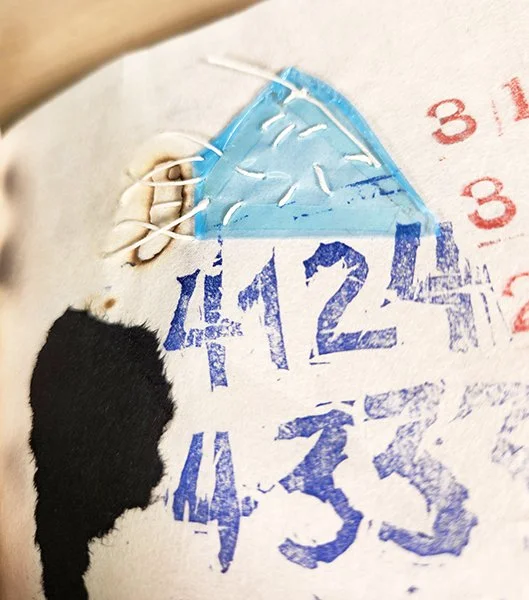
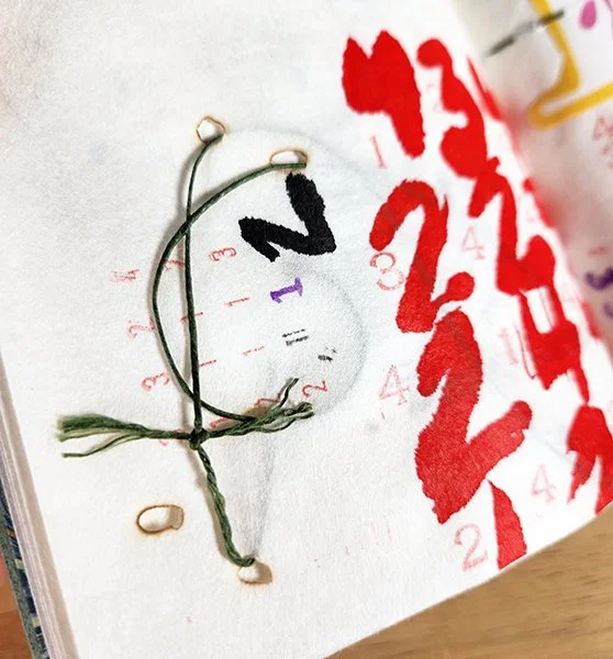
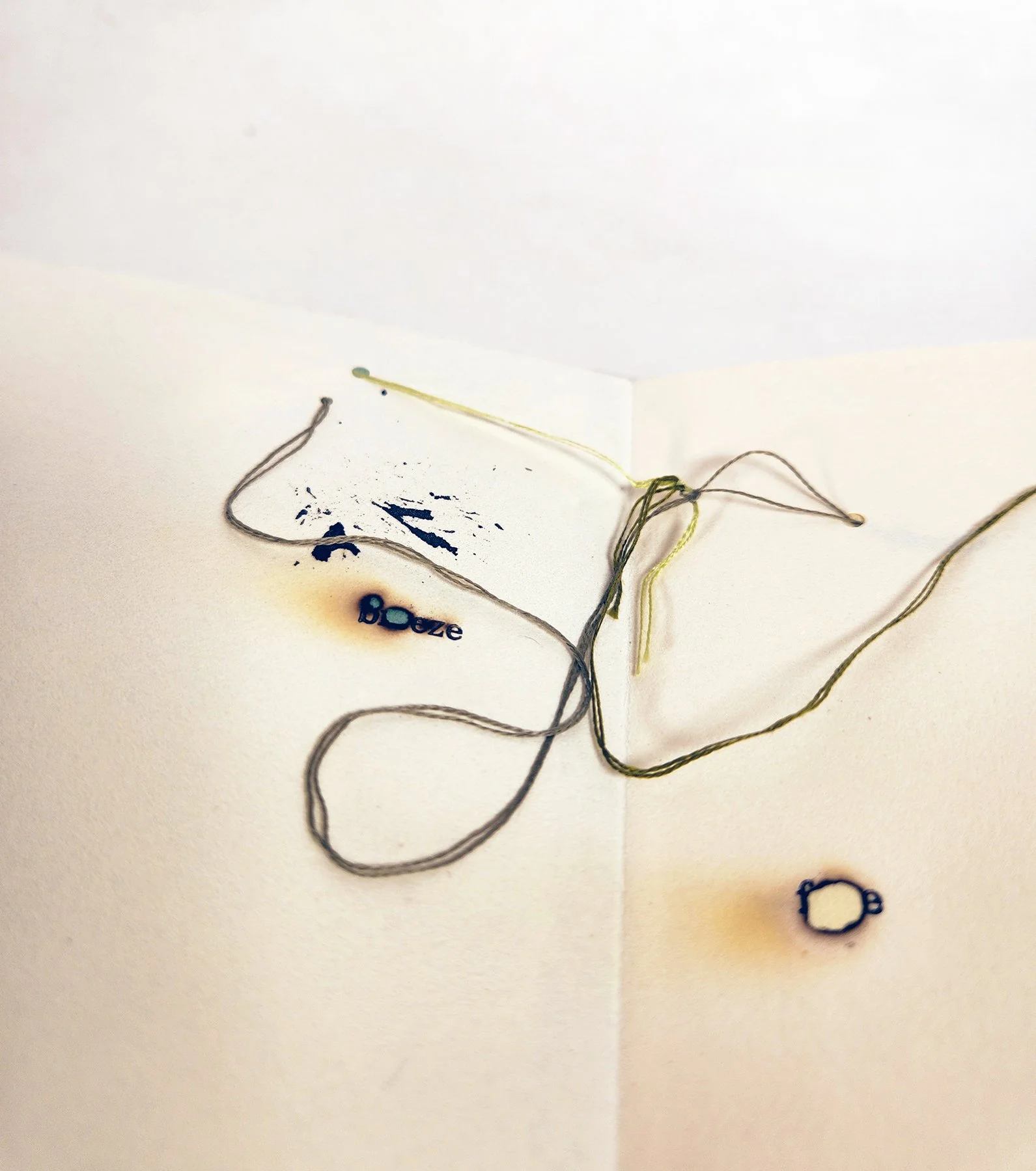
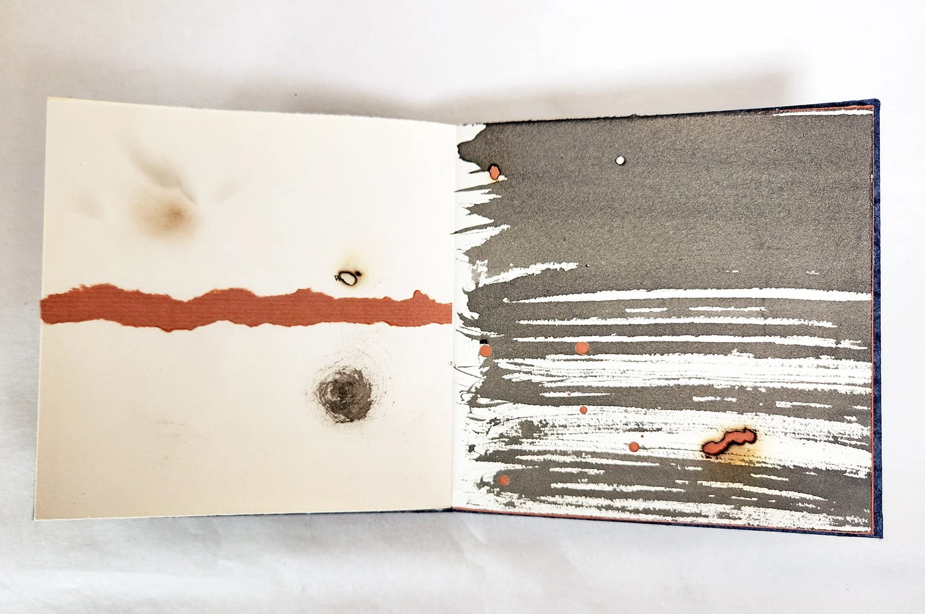
At present, I only have copies available that are printed on my old school notebook paper. I love the varied widths between the lines on their ruled pages, and how some lines are vertical and some horizontal, depending on the paper’s grain direction. I also love the different degrees to which the pages have yellowed—all of those rich, physical details that characterize a book with an analog body that ages much like our own.
Due to the limited number of copies available to start, I am not posting it to my shop yet. Please send inquiries to me at hockensm at gmail dot com if interested.
2026
4.25” x 4”
66 pp. + 8-page supplemental pamphlet
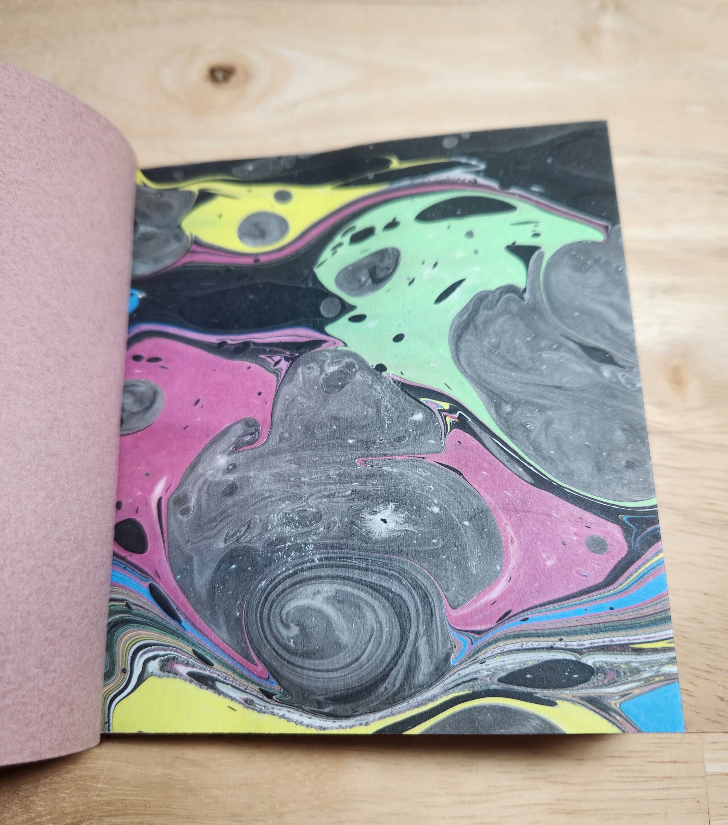
stab binding, with hand-marbled endsheets
letterpress
1st printing of 20 copies on ruled, vintage notebook paper; and 10 copies on new Staedtler graph paper. Both versions available in 5 colors: dark rose, blue, green, light rose, and gray.